Saturday, July 30, 2011

011. Personal Taste Rage

011. Why am I not dynamic enough?

I've recently been trying to figure out a good layout for my graphic art portfolio and business, Virtual Crisis Media, which has been untouched for awhile. It's gone through two drafts, one I decided to settle on, and I showed a few of my friends enthusiastic.

Sadly, it wasn't as great as I thought it would be. The regulars weren't fond of the background graphics - one a photomanipulation of myself (
a friend said it creeped her out), the other side butterflies. The experienced one didn't understand why I had to go for the futuristic neon theme, said it lacked the style he observed from my artwork, and said I was following a Web 1.0 tradition rather than converge to Web 2.0.

Now arguably, this could be a matter of taste. Me and my friend definitely have different tastes - he's Apple, I'm Windows, he's left-brained, I'm right-brained, he likes women, I like men, etc. While that certainly hasn't stopped us from working together in the past, combining his interface ideas and my Photoshop powers together and creating some awesome stuff, there's a reason I'm taking his advice seriously: he's had more experience and success in developing web and UI designs than I have, and at this point I've realized I really need to learn and offer that if I want a balanced market and income online.
A PSD Vault tutorial for a Web 2.0 button, taken from
Naldz Graphics' 40+ Best Photoshop Tutorials for Creating Buttons and Badges.

I've had a very mixed opinion on the "less is more" motto of Web 2.0, where everyone knows Apple's name. Heck, I can't shake off how so many Web 2.0 things remind me of Apple that it bugs me tremendously if I'm doing a set of tutorials to coach myself and the icons look as though they're going to settle and float at the bottom of my screen any second.

It unnerves me how behind I really am on technology, especially with smart-technology - I mean, I was more than content on having a slider with full keyboard and unlimited texting, the plan is affordable and the model is nice. Meanwhile I have my friends scanning BBMs and asking me how to use smilies again when they log onto their unlimited Facebook or MSN intentionally to taunt me (and they don't even use it that much).  

Screenshot of a mobile UI from Creamscoop.com

I've noticed a very important trend too - mobile internet. It's here to stay as well and the convenience it offers is astounding. How many websites that offer mobile browsing is one factor, but how many websites that take into consideration the integrity of their UI layout + graphics + browsing structure and manage to incorporate enough of it into the mobile versions of their sites is something else. I saw a web layout that looked incredibly simple, sleek, and devoid of anything artistic touch - but it would be able to survive in both internet and mobile in terms of what content it offered and how the content was structured as a news feed.
 
I'm probably going to end up keeping a good portion of my current design for VC Media anyway since it's my website, but it feels as though my personal taste is getting in the way of the dynamic industry that is new media and technology. Now, as somebody who would call herself an artist and as an individual, I'm obliged to have my own opinions and interests. That hasn't gotten in the way before.

But right now, if my tastes and choices end up interfering with how I'm supposed to be doing my job, something's not right here, and I need to get those textbooks/online tutorials open and my pen/mice/tablet stylus* ready before I embark on fully filling the role as a proper graphic designer.

*I do not own a tablet.

Tuesday, May 3, 2011

010: Gradient Rage

Why do people use terrible, terrible gradients?

I apologize for the mass delay of a new post. It has been far too long since I've even touched any one of my websites. The reason being my other job finally took more priority over my focus on new media to the point where I've hit lethargy and I absolutely hate my job right now. 

But a job is a job - however, there's always perks outside of a "job" (other than resigning and moving on), like something you actually enjoy doing. I've found hope in being paid to design a poster for my high school's annual art show this year, which is a great honour since last year I also designed their poster last year (it wasn't that great now that I look at it), and now I'm more than excited to create a great looking product. 

However, while I was walking around the school, I noticed posters advertising our annual high school talent show. Their theme was parodying Youtube, and there was an alright turnout for audience. Surely the posters would reflect on the talent since it was my school doing it!

Except the posters looked like this:

A replica of a poster I saw. I swear, it looked almost exactly like this.
WHY?! What in the name of all that is good and well-created possesses you to do something LIKE THIS?!!

I have a couple of nitpicks about this:
  1. This isn't so much a nitpick but something I observed. The designers used Illustrator to make this poster, evident by how crisp things were when I looked at the prints. That's fine, I always regretted not learning how to use Illustrator enough in high school and I appreciate the fact the teachers are telling their kids that this is the program you should be using for graphics since vectors > rasters for print media. 
  2. The placement of objects and text are messy. Ticket prices and information should not be blended in with a gimmick of the poster - they should stand out because that's what people are looking for the most. I'm aware it's at the bottom right corner, which is where people living in North America's eyes will travel when reading, but it doesn't stand out at all. It wasn't even bolded.
  3. If you're going to make it look like Youtube, at least put some effort into getting some things right. Creative liberty is fine, lack of effort is not. Making Likes purple and Dislikes green just makes me incredibly bothered, and not in a nice way.
  4. Why is the vector guitar player (it was a vector of a guitar player on the real poster) floating above the lines of the box? We can tell his legs have been cut off and the Drop Shadow filter looks terrible since it highlights that cut-off.
  5. The fonts and filters are terrible. For that red font, it actually had a 3D filter on it, and it was Lithos Pro. I'm not joking.
  6. These ugly demon-spawned eye-blinding gradients.
It's not even "the gradient doesn't fit this logo so much as flat colours will" kind of problem. No. That is excusable because you can get away with it with a few critics here and there if it's publicly available as a general attention grabber. This is a major problem, and this isn't even based on the style of how something is coloured. This is something "PINK, GREEN, AND BROWN IN A RADIAL GRADIENT WILL LOOK GOOD BECAUSE IT STANDS OUT AND I TOLD YOU SO".

I say pink, green, and brown because when I walked into a class, the teacher was teaching their students how to make text logos in Illustrator by doing this. With Impact font. With a 5-stroke bold black outline.

It infuriates me so much I'm tempted to throw all decency out the window and caps-lock rage with F-bombs dropping all over the enemy bases. I can't even describe how mad this makes me. This is NOT reflective on my high school's creative abilities or the talent show at all. I have SEEN the talent show. I'd say it was pretty good, I liked it just as much if not a little more as when I saw my own high school's talent show when I was still there. (Heck, two teachers who taught chemistry and math performed Holy Diver by Dio in-between an act. And they were really good. If that isn't epic I don't know what is.)

If this is what my Communications Technology class is teaching their kids to do, I'm disgusted. I will lead a revolt if they are actually getting graded to put gradients on their work in this kind of manner. I'm pretty sure some of these kids want to go into some type of media design or graphics and THIS will get them nowhere other than the pegboard bulletins in college that eventually get overcrowded by more . Even babies know that these colours do not work if you want to make something look good! I can actually feel my stomach twisting in rage just raging about this. 
A revision of the earlier poster, in terms of following similar layout.


I was so angry I stayed up until 2 AM re-creating a better version on Photoshop. While it's not Illustrator, you are capable of the exact same things using that program, but that isn't the point. The point is making it able to look at because of time, effort, and using what I knew. While this doesn't stand out as much as the one with ugly gradients, it is certainly easier on the eyes, looks better, and makes you want to go to the show.

The only gradient present here is the one in the Tube logo. I also followed using the school's main colour more prominently in the photo (substituted for Raster Rage's sky blue in here). Their school colour (which is teal) grabs attention just as much as pink or green or poop brown combined together. This way, it helps unify the idea that this is for the high school more.

I also left the ticket prices and time where they were, but made sure they stood out than the rest of the poster. Not only does somebody need to teach how to make this stuff look pretty, but how to make this stuff look important. If you're putting that kind of information in the bottom right hand corner, make it stand out! This isn't a page number, IT'S THE FIVE W'S. Bold the font, outline it, add some colour! Follow the Rules of Reading too - unless you're in various parts of Asia, people aren't going to read right to left. Don't put it on the left unless it'll stand out a lot, and even then, it's not a good rule to follow since this information is better in the middle.

And FINALLY, no matter how bad these filters are, the Lens Flare > Eye Blinding Gradients. 

I know the Lens Flare is a terrible, cheesy filter. But it works. If you really need some kind of forbidden filter to use, use the Lens Flare. It has NOT failed me yet, it has made my high school website banners stand out, and it has made other campaigns where I required graphics successful. People will look faster at shiny stuff rather than a bag of Skittles (unless they really really like Skittles) and this is why it's better to use that for graphics if it has to come down to it.


This is a picture of David Tennant from Doctor Who, known for being the charismatic, crazy Tenth Doctor.


This is when I put the two filters together. Which would you rather look at if you had a choice between these two?

If you're going to use gradients, don't make them the main attention grabbing point. People will look at it, sure, but they won't want to when they see the hideous rainbow of colours hurting their eyes and it won't appeal to them as much as something stylishly done while grabbing the right amount of attention. Use it subtly and not directly. This isn't a Powerpoint presentation from elementary, it's supposed to be a semi-professional advertisement trying to sell people something.

That my old high school which has taught me some of the greatest, wonderful design techniques has now degenerated to not knowing how to design things or put any effort whatsoever into their own creations makes me more than upset.

*Should the kid who made the horrendous poster presented in this example be reading this, I am NOT sorry for your lack of effort and time. I would have given you a failing grade if I was your teacher and that was an assignment; that kind of garbage is inexcusable and I'm sure you can do much better than that.

Monday, March 21, 2011

009: Stock Rage

What harm presents itself when using royalty-free images, brushes, or stock media in general?

I don't remember what I was Google Imaging when I stumbled across this image:

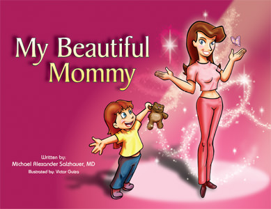
My Beautiful Mommy, a book aimed for the children's market about plastic surgery. Yeah.
 The first thing I thought while looking at this wasn't "well, this looks absolutely weird" as my friend did when I showed it to him but "isn't that Obsidian Dawn's Glitter Brushes set?" 

Then. "I'm going to assume the layer the brushes were on was set to Overlay Mode." 

Some excerpts from the book found on Josh Harris' blog. Brushes, brushes everywhere.
In my defense, I used and abused that brush set to the point where without it I don't think my products they were used for would have looked as good - but I can recognize Comic Sans MS and Calibri from a distance as well as who used too much Feathering around that woman on the pizza brochure. Brushes, though, add flair and magic to your illustrations without too much additional stress or effort on your part. I love brushes. This, in my opinion, isn't entirely a bad thing - I personally still need to purchase my commercial license from OD since I do like their brush sets as much as this illustrator clearly does - but there's obvious flaws to using stocks:
  1. There's arguably no originality from the use of these and you can no longer really call it "your work".
  2. They look tacky, poorly made, and do not match the style- you're better making it yourself.
  3. They are overused and you are at risk getting called out on it quickly by losers like me.
There are many other dangers. There was this manga that had a plot point about this company using a stock image, untouched except for text and information on it, for their product...at the same time another company or business used the same stock image for their product. Two of the workers had to stay overtime past closing, way into the evening, to fix the image and re-print dozens of new copies. (I forget the name of it, but graphic design only played a small part in it. Like a really small part. It's incredibly NSFW too.)

Here's the thing, though - if I do not want to put too much more effort into what I am doing, or if I really suck at designing a certain effect, stocks are perfect. I'm not a photographer, so if I need a certain photo, I go to Morguefile. Photoshopping specific kind of sparkles takes too long, so I go to Obsidian Dawn. It helps, and it shouldn't take full credibility away from your work. To make a properly executed gunshot scene in a movie, you need a combination of a muzzle flash, maybe a 3D render of bullets, and blood squibs as well as a Photoshop layer or two for bullet hits. God knows how much more hours that would take if you had to make all of that from scratch, but the fact is, it's only one detail in the whole production of the movie, your movie.

The logo for Obsidian Dawn's website, which provides brushes, vectors, and stocks.
This is why stocks make your life easier - it's quick access without money to what you want or need, and you lose less hours over the effects if you want it done as soon as possible with some great results if you know what you're doing. (It will still take you time, though. For gunshot example; I tried this once and it took two hours. I used Premiere too instead of After Effects. Don't do this kind of stuff with Premiere.) If it's free - or better yet, if it has a use and purpose whether or not it costs money or not - then why not use it? That's what Video Copilot packages are for, that's what Morguefile is for, that's what Dafont is for, and that's what Obsidian Dawn is for: to provide a bountiful amount of readily available products of varying quality for whatever you want or need.

As for overuse and easy recognition...well, it's a given and there's not too much you can do about it. If it's good, of course people will use it more often than others, like O Fortuna as their cinematic trailer music. Why else do you think obviously breathtaking masterpieces* like the Wilhelm Scream are still around?

*Given what the Wilhelm Scream is and what it defines in its place in cinema this statement is either sarcasm, truth, or to each their own. You decide.

Wednesday, March 9, 2011

008: B&W Lip Contrast Rage

Why do I have to make lips darker when I use auto B&W filters?

It's been awhile, yes. But that's because I was trying to come up with a few topics I should cover that are more graphic-related than whatever's happening in New Media for this entry. I couldn't think of anything I wanted to really talk about, though...until lately when I had to do this.

As some of you gamer geeks may know, Pokemon Black and Pokemon White came out on March 6th. This is relevant because today, I'm going to be talking about black and white digital quickshops - not necessarily photos, but quickshops, those times where you want a cool filter on your Facebook profile photo and you don't want to stress too much time with whatever it is you're doing. But beyond black and white quickshopping, I'm going to talk about my biggest quirk with it - lips.


This is my demonstration subject, a profile mugshot of a young Milo Ventimiglia of Heroes fame from his Gilmore Girls days. Note the contrast between his lips and his skin - a very obvious coral pink from the rest of the yellowish-peachish skin colour, both standing out on their own. (This shouldn't be too hard for the ladies.) I'm going to make Milo black-and-white by running a Desaturation filter. Pay attention to the difference in detail as I will place the original photo next to the result:


Now this is the reason why most people don't tell you to use a Desaturation filter when it comes to making your photos black and white - it's the wrong way of doing it. Granted, you could probably play with Brightness/Contrast or Levels and Curves but why bother taking additional steps not recommended at all? This also applies to Grayscale mode - don't do it. As you can see, we've lost Red Alpha Channel (a.k.a. we've lost many details in the lighting), but worst of all, Milo's lips are practically the same shade with the rest of his skin and they no longer pop out as much.

For some, this might be okay. I mean, I think it's okay, but we're talking about Milo Ventimiglia - I could care less if there was a rainbow gradient over him, it's not distracting from Milo himself. Actually, this is a pretty good photo in general of just running a quick auto-B&W filter on because it still keeps enough lip shade. Here's the same photo, but with that quick auto-B&W filter applied:


There's a little colour you notice in the B&W filter compared to the dull grey of Desaturated, there's more preservation in lighting, and best of all, his lips contrast with his skin a little more. Awesome. Always use the B&W filter on Photoshop to get the desired lighting, alpha, and control you want with B&W photos. There's also Channel filters but since I'm still studying Channels (which are really handy, by the way), we won't go into that. This is for quickshops, something under five minutes.

Now let's say the only thing you knew was Desaturate. Okay, well, we're going to take our Desaturated photo, and we're going to brush black over his lips. Yes, we are essentially putting digital lipstick on Milo Ventimiglia. He's probably used to real-life makeup on set anyway.


As you can see here, we did this in three steps: 
  1. Painted black over Desaturated Milo's lips using a brush
  2. Applied an Overlay/Soft Light filter to the paint layer so it's more natural-ish
  3. Dropped the Opacity down to about 15% - 20% so it's more natural and no longer ish  
Here's the before and after side-by-side:


As you can see, it's very subtle, but there is contrast between the lips and the skin now. 
Now, let's place the Lip-Coloured Desaturated Milo with Auto-B&W Milo and Milo and see the contrast similarities:


I'd say that's pretty good and now, they more or less match each others' contrast. But to conclude, I wish I didn't have to do this lip-colour-contrast thing as much. The B&W filter itself, auto or maual, works far more superior over Desaturate or Grayscale filters for better preservation of alpha and lighting, as well as control over those - but I personally like to see a little more lip contrast on B&W photos, even if it's subtle. That's something I require another layer for. 

Friday, February 18, 2011

007: Change Rage

Why are websites keeping layout or usability changes nobody likes?

About a few weeks ago while I was on Facebook, I found out I had this:


Oh dear sweet mother of Thomas Edison just no.

This is Facebook's photo-viewing lightbox, implemented sometime last year. I abhorred it. I used Fancybox on my own website for this type of thing, but I had pages linked to non-lightbox versions of my gallery works for those who wanted to view it in a bigger size.  Unfortunately, there's no way I could turn this off and never see it again. I've looked on Gizmodo, Engadget, Google, and there appears to be no way of doing it simply on Facebook without some kind of browser extension or one or two clicks or keyboard commands. Call me lazy, but even that seems like too much effort for something I simply would like to turn off.

Is this the only time I've had this box? No, when it was first implemented I hatedx3 it and I ranted about it so much, it would make a Livejournal user proud. Eventually, it went away, and I could only imagine Facebook finally answered the outcry of majority dislike against it. Nope, Facebook just decided to spare me for awhile before it returned.

First off, I'm biased. I don't like change. If it completely changes how something I have become used to is done, I'm very against it. There were some changes I liked that websites have done over the years. I like how Youtube can let you change the titles of your videos now so you don't have to reupload them just for a new title. I like how Facebook decided to move names above statuses or posts instead of right next to them. I like how Google lets you turn off the automatic search if you don't want it to automatically search something random for you. I don't like how Facebook doesn't let you turn off this blasted lightbox, I don't like Youtube's latest front page layout, and for the love of all that is good, what did Gawker just do to their websites?!
Haters to the left - which is Gizmodo.com's old design before the new design, on the right.
Screenshot taken 02/18/11, click for full view.
WHAT. HAPPENED? If anything, this only proves to me I'm incredibly out of the loop since this looks like it's set on mobile compatibility and I lack a smartphone of any sort. But from first impressions, I see attempts at a sleek white style a la Apple, a professional tabloid-type feel like online newspapers and any free Wordpress/Blogspot preset, and Serif fonts.

Freaking. Serif. Fonts. As the main typeface on blogs about the latest in the geek industry.

There is a reason Apple doesn't use Apple Garamond anymore and that's because Myriad exists. Anybody who has been paying attention to the latest in the geek industry knows that clearly, Sans Serif is the way to go. As somebody said about this as well, these new Gawker layouts lose all personal touch - now I'm immediately looking to the left instead of the front page I may or may not be interested in, instead of just scrolling through the front page and easily picking out what I want to read based on what pops out.

I find that accepting major changes like this, or in general just dealing with it as life moves on, is either incredibly easy or incredibly hard during the transition. Transitions are difficult when it's a huge jump from the sun to the moon. Heck, sometimes you might not even be able to accept the change at all and just ragequit, something I'm probably not going to do until Facebook gets triumphed over. This applies to real life as well as anything beyond web structure and design. But, here's the thing - why should we have to accept that change?

My last blog post, Corporate Logo Rage, discussed how that new Gap logo was so terrible that they actually reverted back to the old one. Some people wondered why Gap would cave in, claiming it showed weakness in the strong business hold it was supposed to have as a corporation. Others said it was good that Gap reverted back, claiming it showed that the customers and public were held in the utmost importance to guarantee full satisfaction.

The majority didn't accept Gap's bold Helvetica gradient-square-in-the-corner change, because the majority didn't like it. And God help me, if that can happen, then why can't I at least turn off the Facebook lightbox if the majority didn't* like it either?

*By now I suspect people have gone through the getting-used-to-it phase if they've had it for awhile. I've only recently gotten this so my outcry is a little late. That isn't the main point though.

Monday, February 7, 2011

006.3: Corporate Logo Rage [Final]

Why are corporate logos becoming simpler?
PART 3


PART 3: Answering the Question 
In Part 1, we discussed and dissected the THQ logo. In Part 2, we discussed and dissected the Starbucks logo. This entry, Part 3, is where we will finally bring it all together and relate it with the above question - why are corporate logos becoming simpler?

Starbucks and THQ both expressed changes with their logo that were very minimalist, simple, and not complicated. From three colours they dropped down to one or two, and for detail they dropped down to little. Some agreed it was a good improvement, and some like myself agreed it was unnecessary to just outright bad. But, the changes have happened, and the changes are here to stay, as most changes do.
Enter our third star: the Gap logo. 


If you haven't heard the story about the Gap logo, there's plenty of articles out there on your search engine should you search up for this. But in a nutshell, Gap changed their logo awhile back and there was so much controversy over changing the old-fashioned all-caps serifs font in a box to this 100% black Helvetica thing with a gradient square in the very corner, that this controversy could make the oceans overflow. There is even a Twitter account and a person who made a Gap logo generator because of this.

It was so bad Gap has recently announced they would keep their old logo. I am not making this up. I would discuss why but the last time I did, a Part 3 had to be made. So to make sure we don't go off-topic again, allow me to link you to this video from CNN that showcases a few good examples of important and interesting logo changes. Watch that first if you haven't already, I promise you it will be worth it. Also, read these lists from Under Consideration of The Best and the Worst Logos of 2010. 

Now, let's list off a few trends spotted in a majority of these as well as in general. Here's the major few I have spotted from the recent trend of recent logos:

  • less is more, like a lot less
  • add a pun, preferably to the type
  • incorporate your logo into the type
  • do the above but make it smaller
  • use lowercases, a lot
  • use sans serifs, a lot
  • use lowercases and san serifs together, a lot
  • ditch capitals and just use lowercases period
  • if it ain't broke, fix it anyway

But how could this go possibly wrong? Surely, Gap has followed all the steps to making a logo that will fit in with today's standards, especially when most of these logos are headed in such a Web 2.0 direction! They used a sans-serif font, they used lowercases instead of all-caps...how did this happen?

Quite frankly, it's because the new Gap logo looks like garbage. I'm not going to go into technical detail about it because I just look at the new Gap logo and I don't like it at all. Everyone else has spoken for me. 

Now, there's a few other logos I don't like that have followed the latest minimalist trend. On the Best list of Under Consideration's website, MySpace and Comedy Central are on there. I completely disagree with this. I hate Comedy Central's because I find it boring and dull regardless of the pun, yet I don't spend as much time being angrily confused by it as THQ's since have no idea if it would fit the mood of any of their programming since I don't watch it. It looks more like a parody logo than anything. I dislike MySpace's for the same reason - although when I went on its site awhile ago with a friend and he placed his cursor over the logo, the space started turning into an animated bag filling up and it was sort of cool for an Easter Egg, but that's it.

As I look at more logo changes happening recently, the majority of them seem to be shooting for at least one or more of the trends listed above. I used to think this was simply for internet and the lingering, spreading trend that Web 2.0 has brought upon us. But clearly this has expanded to the outside of the web as social media and technology becomes more prevalent in society and things are becoming more simplistic for the future. This has been happening since the concept of modern furniture was created and the first iMac and iPod were spawned from Steve Jobs' genius. Heck, even before then, this concept - that everything is developed with the goals of being simple and intuitive so everyone can use them or relate to them - has been what has revolutionized technology and business today.

I believe the primary reason this is happening is bandwagon riding. All these logos are attempting to follow the trend bullet points that exist today, just like teenagers who want to fit in in their high school days and be popular. Heck, if Wingdings became something used often for logos, I'm pretty sure that would become a trend too. The difference being is that if you don't ride this bandwagon, that means you are not up-to-standard. Nobody cares if you're up-to-standard in high school, but in the real world, it's kind of a big deal to be in tune with what's hip and happening. This does not have to be a bad thing in the business world - it is to make sure not to get lost behind and not meet the standards, in this case with the design channel.

But is this really a good trend to follow? 


These are, respectively, the Walmart and Best Buy logos. On the left are the old ones, and on the right are the new ones. The new ones follow the lowercases, the friendly-looking sans-serifs, and the minimalist approaches. Noted by quite a few, however, is that the old ones stood out more and look far more dynamic to the arguably generic and too simple revisions.

And in the end, what works, and what doesn't? In a world, mainly North America, where it is important to please the majority to make good money, and where being creative and being generic have become fine lines to easily stumble over, what do you do, and will lowercase sans-serif fonts save the day?

Tuesday, February 1, 2011

006.1: Corporate Logo Rage [THQ]

Why are corporate logos becoming simpler?
PART 1

This was supposed to be published around January, but I wasn't sure exactly how to tackle this entry on during that period of time. There was a vast variety of logos I could tackle and lump together, but I wanted to focus on a select one as well as expand on that without drawing it out too long. Now, I think I can.


PART 1: THQ's Logo
To the left is the old THQ® logo, to the right the new one.

A couple of weeks or so ago (somewhere during that period of time), the THQ logo changed. Now, the only reason I care about this is for two reasons. The first reason is as a graphic designer, I feel obligated to follow along with the trend of logos and see what works and what doesn't. The second reason is because no matter how much I open my mind I just absolutely cannot bring myself to even one bit like this thing.

I just...I cannot see the appeal in this. I've been reading blogs and forums on their opinions with this but I just can't. I understand that everyone is entitled to an opinion, but from the looks of it there's a huge majority approval for the new THQ logo. Now, bringing up a music analogy again, following the mainstream isn't the way to go but it is what popular and therefore it is what sells. Majority approval can be argued as equivalent to conformity, but that's another type of debate and topic.

I've never been part of the mainstream though or clued in with what's hip and rad* nowadays, and I'm 18. I actually liked the old THQ logo. To be honest, I didn't care about the logo at all, and to be second honest, I don't even think I played a THQ game. But it always stood out to me as something very bold and daring, cool, and - dare I say this and go under fire for breaking gender political correctness - manly. Well, maybe macho is a better word for it. I'm scrolling through a list of games this company has produced and I see a handful of these are pretty macho games - not all of them, no, but a handful. Obviously there are exceptions (particularly with Bratz and All Star Cheer Squad), but I perceive the old THQ logo as macho and cool.

May I also add on that I have seen this logo get effects slapped onto it more than the first time I learned how to use Photoshop and its filters. In my opinion, this step was for the better. In my mind, the THQ logo has a metallic gloss and emboss as well as possibly some shine. Almost never do I invision it as some flatly coloured object because when I see this logo, I always see it will metallic gloss and emboss in a really cool animation against black.

Now I look at the new THQ logo and I'm just...why? Why is there no more black? Why is the H lowercase and flipped around or cut off? That Q doesn't look like a freaking Q, at least the old logo was legible. And why does the Q pop out more than the dull grey of the T and the H? I don't see this as creative and innovative at all. Nothing pops out and shows itself off, it looks boring and dull, this won't look good on a black background, and I'm not sure how this would look animated, especially with that blasted Q. It looks like a red carpet unfurling.


Earlier I was talking with a friend, also studying graphics at an tech college and more keen on logos than I, about how this could work - not work as in good job it's better now, but work as in it gets the job done. If we go with the red carpet example and it wipes out or flies out or however it transitions, it shouldn't start from the bottom near that Registered Trademark symbol. Rather, it should start from that indicated green line starting point, so that it makes it clear that this is a Q and not some kind of strange question mark. For the record, why is the Q's tail going beyond the T and H's bottoms?

I just don't like it. I really don't. I don't think it's modern, stylish, and professional, I think it's incredibly boring, dull, and illegible. Maybe it needs a gradient. Maybe it needs a video. Probably the animated video, I'm looking forward to that. But, that isn't making it simpler. 


Which brings us to the original question: what is with the trend of simplicity with recent logos?

I'm hoping the program I'm taking at college will teach me something about this because somewhere along the line I would like to learn what makes this a good logo at all. The majority agrees, and that's all that matters when it comes down to the business, the marketing, and the positive feedback customers will give. 

Heck, Gap changed their very recently changed logo back to their old when people didn't like it. But that will be covered in Part 2 of Corporate Logo Rage, coming this Thursday when we further discuss why corporate logos are becoming simpler.


*hip and rad = not the terms I use for whatever is hip and rad today. last i heard it was dope or ill or sick or diseased or some crazy drug-related terminology.

Wednesday, January 12, 2011

005: Graphic Design Rage

Why is it when you Google Image "graphic design" you always get this?

From napleswebdesign.net
It's worse when you Google Image "graphic illustration". Now, I'm not saying this bad, I love these kind of things. But this is what a majority of people must think of right away when you think of a graphic designer: minimalism and a thousand circles and lines with gradients all over with eye-popping colours.

Obviously that's not what it's limited to but it's something that has always bugged me even before I wanted to start doing this. It's cool, but it just seems very overdone now and I haven't seen any unique examples that stand out from the rest lately.

Breaking my Tuesday-Thursday schedule plan to update this blog since I don't have outside work this week until the end of it. (When I say outside work, I mean a job that is not related to graphic design, but let's not get into that just yet.) I've managed to personalize this blog a little with a new banner as well as some other things added. Note the word "personalize" and not "spice things up/make it look better" since I know where the fine line is between those two. Let me know what you think with some comments or some feedback!

I'm also looking for some affiliates, as well as anybody who wants to promote their website or services right now. Hit me up as well on the comments or drop me an email at vcruz (at) live.ca and I'll get back to you ASAP!

Monday, January 10, 2011

004: Sexism Rage

Why are women not as prominent in New Media industries as men?

I'll take this time to write about something not quite related to graphics again, but more so gender, as well as linking to a few good reads for those who crave knowledge like I do. Now, this debate has been going on for generations. Heck, you don't even have to use New Media in this case - this debate has been going on forever.

Allow me to turn your attention to this article about the lack of women at the top of Web 2.0 companies on All Things Digital. It's a fairly interesting read, if not something we've all read before. Did this headline catch my attention because I am a woman? Absolutely. Now, I'm not entirely sure if I want to get involved in the social-networking side of new media in the future, nor the programming side - I mean I've taken one class for the only New Media course in my city and targeted school, which had Flash programming, and I can safely say that is not what I want to do - but the point is this is something relevant to my interests, both as a person and as somebody whose career falls into a niche in New Media.

Now there was one thing that brought my attention back to that article, and it was when I was browsing around Wikipedia (because, you know, Wikipedia is just so reliable, or so according to CNET). I was Googling Mark Zuckerberg's girlfriend - no, this is not creepy at all when there was a movie just recently released about this and might I say it was a very good, thought-provoking movie - and landed on Zuckerberg's profile. There was a sister listed on that page. I clicked there.

Found on Brian Solis' flickr
www.briansolis.com and bub.blicio.us.
Randi Jayne Zuckerberg[4] (born 1982) is the marketing director of Facebook, and sister of Facebook founder and CEO Mark Zuckerberg.   
...wait, hang on, I thought that article from earlier just said that...
...the Facebook board is all men, all the time, composed of CEO and co-founder Mark Zuckerberg, prominent techie and venture capitalist Marc Andreessen, investor Peter Thiel, Accel Partners’ Jim Breyer and Washington Post head Don Graham.
The last time I checked marketing directors were part of that board, and Randi, who is not only Zuckerberg's sister, is a woman. 

For goodness' sake, this is the 21st century. We are overcoming enough stigma as it is, so is this merely over-exaggerating in favour of the article and its message towards women? Granted, yes, I don't see enough women discovering the more well-known, mainstream companies, but they exist and they have still accomplished just as much financially, famously, and perhaps even mentally. 

Arguably, is sexuality and physical different still a reason why this gender issue has not been settled? Harassment lawsuits and women getting fired for being "distracting" apparently still happens? iJustine, a female graphic designer and technology buff and reviewer, who has dominated in the niche of Youtube partnership and video, falls under criticism for this all the time - I mean, just look at some of the comments on her videos. A good handful of them (usually straight males) are not there for what she has to say or review. I myself am quite sure she could very well be a model and still live with the same income she earns from making videos on Youtube, but there are many women who could do that, simply because it's easier based on their gender dominance in that industry. 

Found on newsrealblog.com
Yes, women and men are biologically different. Yes, some of them are geared towards certain things more than others as studies have shown, whether this is something they cannot control like puberty or something they can control like, oh I don't know, their career path. Once again, though, this is a new age, this is new media, and no matter what your gender is, this age has majorly accepted that it is the skills and the success of a human regardless of gender that matter. It's anybody's game, and you just have to play it right.

(On another note, I will be setting up a schedule now for when my blog posts appear, which has tentatively been placed at Tuesdays and Thursdays as must-post days. Yay for content!)

Monday, January 3, 2011

003: Bot Rage

I woke up to this:


What in the name of Halle Berry is this?

This entry will be the start of something a little more out-of-topic with the blog's main point but divulges into the aspect of internet - that is, the case of why on earth are bots starting to attack the Contact Form on my website, which you can see here.  I would basically get e-mails listed from myself but instead of a filled-out contact form, it would contain stuff that looks like this:
Values submitted from VC:
Send-contactus : 1
Author Name : [php]echo('casper'.php_uname().'kae');die();[/php]
I have no idea what it's supposed to execute but at the very least it has the word "die" in it, so of course I'm suspicious. 

Now, I think I have a slight idea as to why this massive influx happened. In the previous post before, I had linked my website again as I did just now on this website. I'm going to go ahead and safely guess that the spambots took advantage of this information and now I'm dealing with some type of malicious code. This has happened before, though, so I'm not new to it. This, however, is the first time I have to wake up to find more than 2 - 3 emails of this sort sitting in my, for lack of better terminology, crappy Hotmail inbox.

After finally finding something on Google about this today, it definitely appears to be some type of malicious coding known as a "content injection attack". I'm not going to pretend I have any clue what that means but this is probably bad either way, and I'm probably going to have to look into getting a captcha installed.

Saturday, January 1, 2011

002: Comic Sans Rage

Why is Comic Sans so hated in the graphic design industry? 

I was about to do this whole entry in Comic Sans as well as a blinding default 8-colour font, but luckily for you, Blogspot knows what people don't like.

I used to use Comic Sans MS very frequently for things like my emails with backgrounds and colour fonts, for my pictures and fanart, and for school projects. This was when I was 11 years old. Now, I've since grown up, and I have seen something in a new but terrifying light, kind of when I learned what a Mary Sue was when I was still involved in fandoms. 

After much careful observation as well as research, it appears that the only appropriate time to use Comic Sans is:
  1. if you want to be ridiculed by designers who have jumped on an elitist bandwagon
  2. if you want to be ridiculed in general
  3. never
The hate for this font is astounding. I'm quite sure it has even become a bandwagon, which I have happily hopped on to protect my budding career path as a graphic illustrator and designer myself. There has been many reasons presented as to why it is a bad font, which I will not discuss here, and there are plenty of good sites out there on Google that explains why - one of them being why it isn't even appropriate for comics. 

(Some good links will be posted up some time in the future when I make a part two to this.)

However, all of this still has not stopped people, nor in fact, cities. I just came back from a trip from Vegas for the holidays. This is a photo of a tour bus I immediately whipped my head and wide eyes at while near the Circus Circus hotel and casino which I invite you to click for full view of this amazing feat:


This bus uses Comic Sans. 

Oh my God.

That surprisingly wasn't the only example there! Las Vegas is the most prominent example of Comic Sans use and abuse that I have ever seen, and it amazes me how much they get away with it garnering from its reputation as the city of entertainment and flashy ads. You don't need Comic Sans with the things Las Vegas gets away with. Their souvenirs, their signs, their billboards...heck, I'm pretty sure even the prostitute cards they hand you in the streets at one point had Comic Sans.

(I would have grabbed one for the sake of example, but I had parents with me and I was hesitant on accepting pictures of naked women from shifty and silent strangers. But it also would have been a good example for a possible Retouch Rage entry in the future.)

I noted this to my mom, who gets annoyed when I pointed out "the most pettiest things". It essentially went something like this:
Me: Noooooooooo!
Mom: What the heck is your problem now?
Me: That bus has Comic Sans.
Mom: You always say that like it's the bane of existence. It's just what works!
Me: But that's not how it should be!
Mom: Well it works so too bad, let them do what they want to do.
This is not the only time I've raged at Comic Sans. While walking through a college with a good friend of mine - who is a budding entrepreneur with knowledge and abilities for graphic design - we walked through about God knows how many posters with Comic Sans. He made a joke about how he knew what font to use on my Christmas card.  

This reminds me of my hate for Ke$ha. Yes, I'm going to use a modern pop music analogy, please forgive me if this ends up sounding very distasteful. Now, most people talk about how haters are hating simply because they are jealous of the success of the other person. I "hate" plenty but I hope I ain't jealous of these people if the definition of jealous means I want to be them. However, I will fully 100% admit that yes, I am jealous that Ke$ha can't sing worth a dime yet she's gotten this far and somebody that is far more talented and can actually sing has not hit that level of mainstream.

This is what my hate for Comic Sans is. I am jealous and bitter that a font that people have been constantly teaching other people not to use for their marketing, branding, or on anything ever, is still being used very frequently in such a manner to the point where it is easily gotten away with. How is it that this typeface continues to be used to such a degree when it's not even that good? Is it because for many years it has been used to the point where, as my mom says, it works because either people are used to it, it has been linked with likability and friendliness, or just nobody cares anymore?

However, the important point of the rage against Comic Sans seems to not be about the font itself. Aspiring graphic designers all around the globe will know from careful research and not blindly following the wagon completely that the reason it is so loathed is because of how it represents poor typography choices, something that many amateurs such as myself struggle with when designing logos or print media. You are not going to see anything other than a serifs font for a jewelry brand - there are exceptions, yes, but it remains unusual to see a sans serif typeface on the logo of jewelry.
Here is a mock logo I have designed for a pet fish supplies brand about two or three months ago. There were many copies of this since it never ended up being final due to mixed responses from the public, which you can see on my website, Virtual Crisis Media. But this one was the one I liked. However, friend from earlier pointed out how the font for the subtitle of "pet fish supplies" (which is Franklin Gothic Heavy) said that it did not match the brand at all, so I changed it.
Here is the changed logo with a Lucida sans serif font in place of Franklin Gothic. I think this fits much more, but that's debatable. In the end, this wasn't a logo I continued developing since I really had no client other than myself and the public's feedback as this was a test logo.

Here's me having fun with the subject at hand with some Comic Sans. However, I'm currently sitting here staring at this wondering why it doesn't look as bad as I thought it would. Whoa.

In the end it is popular topics like this in the industry that makes for good research and learning. As somebody who is still doing that, Comic Sans has certainly taught me a lot. From what I noticed, though, it doesn't end at Comic Sans, though - Papyrus is another example to note, as well as even the staple Arial and Times New Roman, but that's another blog entry. In the end, it's how you use it.

Jester, however, which I used to frequently use as well, is just one of those fonts I don't like anymore for the same reasons as Comic Sans.