What harm presents itself when using royalty-free images, brushes, or stock media in general?
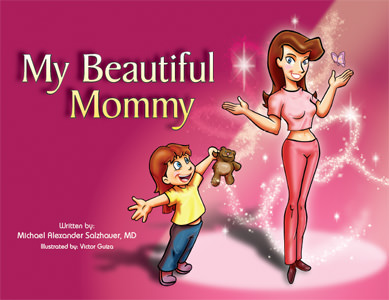
I don't remember what I was Google Imaging when I stumbled across this image:
 |
| My Beautiful Mommy, a book aimed for the children's market about plastic surgery. Yeah. |
The first thing I thought while looking at this wasn't "well, this looks absolutely weird" as my friend did when I showed it to him but "isn't that Obsidian Dawn's Glitter Brushes set?"
Then. "I'm going to assume the layer the brushes were on was set to Overlay Mode."
 |
| Some excerpts from the book found on Josh Harris' blog. Brushes, brushes everywhere. |
In my defense, I used and abused that brush set to the point where without it I don't think my products they were used for would have looked as good - but I can recognize Comic Sans MS and Calibri from a distance as well as who used too much Feathering around that woman on the pizza brochure. Brushes, though, add flair and magic to your illustrations without too much additional stress or effort on your part. I love brushes. This, in my opinion, isn't entirely a bad thing - I personally still need to purchase my commercial license from OD since I do like their brush sets as much as this illustrator clearly does - but there's obvious flaws to using stocks:
- There's arguably no originality from the use of these and you can no longer really call it "your work".
- They look tacky, poorly made, and do not match the style- you're better making it yourself.
- They are overused and you are at risk getting called out on it quickly by losers like me.
There are many other dangers. There was this manga that had a plot point about this company using a stock image, untouched except for text and information on it, for their product...at the same time another company or business used the same stock image for their product. Two of the workers had to stay overtime past closing, way into the evening, to fix the image and re-print dozens of new copies. (I forget the name of it, but graphic design only played a small part in it. Like a really small part. It's incredibly NSFW too.)
Here's the thing, though - if I do not want to put too much more effort into what I am doing, or if I really suck at designing a certain effect, stocks are perfect. I'm not a photographer, so if I need a certain photo, I go to Morguefile. Photoshopping specific kind of sparkles takes too long, so I go to Obsidian Dawn. It helps, and it shouldn't take full credibility away from your work. To make a properly executed gunshot scene in a movie, you need a combination of a muzzle flash, maybe a 3D render of bullets, and blood squibs as well as a Photoshop layer or two for bullet hits. God knows how much more hours that would take if you had to make all of that from scratch, but the fact is, it's only one detail in the whole production of the movie, your movie.
 |
| The logo for Obsidian Dawn's website, which provides brushes, vectors, and stocks. |
This is why stocks make your life easier - it's quick access without money to what you want or need, and you lose less hours over the effects if you want it done as soon as possible with some great results if you know what you're doing. (It will still take you time, though. For gunshot example; I tried this once and it took two hours. I used Premiere too instead of After Effects. Don't do this kind of stuff with Premiere.) If it's free - or better yet, if it has a use and purpose whether or not it costs money or not - then why not use it? That's what Video Copilot packages are for, that's what Morguefile is for, that's what Dafont is for, and that's what Obsidian Dawn is for: to provide a bountiful amount of readily available products of varying quality for whatever you want or need.
As for overuse and easy recognition...well, it's a given and there's not too much you can do about it. If it's good, of course people will use it more often than others, like O Fortuna as their cinematic trailer music. Why else do you think obviously breathtaking masterpieces* like the Wilhelm Scream are still around?
*Given what the Wilhelm Scream is and what it defines in its place in cinema this statement is either sarcasm, truth, or to each their own. You decide.


