Showing posts with label illustration. Show all posts

Monday, March 21, 2011

009: Stock Rage

What harm presents itself when using royalty-free images, brushes, or stock media in general?

I don't remember what I was Google Imaging when I stumbled across this image:
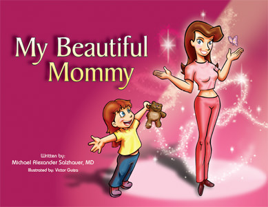
My Beautiful Mommy, a book aimed for the children's market about plastic surgery. Yeah.
 The first thing I thought while looking at this wasn't "well, this looks absolutely weird" as my friend did when I showed it to him but "isn't that Obsidian Dawn's Glitter Brushes set?" 

Then. "I'm going to assume the layer the brushes were on was set to Overlay Mode." 

Some excerpts from the book found on Josh Harris' blog. Brushes, brushes everywhere.
In my defense, I used and abused that brush set to the point where without it I don't think my products they were used for would have looked as good - but I can recognize Comic Sans MS and Calibri from a distance as well as who used too much Feathering around that woman on the pizza brochure. Brushes, though, add flair and magic to your illustrations without too much additional stress or effort on your part. I love brushes. This, in my opinion, isn't entirely a bad thing - I personally still need to purchase my commercial license from OD since I do like their brush sets as much as this illustrator clearly does - but there's obvious flaws to using stocks:
  1. There's arguably no originality from the use of these and you can no longer really call it "your work".
  2. They look tacky, poorly made, and do not match the style- you're better making it yourself.
  3. They are overused and you are at risk getting called out on it quickly by losers like me.
There are many other dangers. There was this manga that had a plot point about this company using a stock image, untouched except for text and information on it, for their product...at the same time another company or business used the same stock image for their product. Two of the workers had to stay overtime past closing, way into the evening, to fix the image and re-print dozens of new copies. (I forget the name of it, but graphic design only played a small part in it. Like a really small part. It's incredibly NSFW too.)

Here's the thing, though - if I do not want to put too much more effort into what I am doing, or if I really suck at designing a certain effect, stocks are perfect. I'm not a photographer, so if I need a certain photo, I go to Morguefile. Photoshopping specific kind of sparkles takes too long, so I go to Obsidian Dawn. It helps, and it shouldn't take full credibility away from your work. To make a properly executed gunshot scene in a movie, you need a combination of a muzzle flash, maybe a 3D render of bullets, and blood squibs as well as a Photoshop layer or two for bullet hits. God knows how much more hours that would take if you had to make all of that from scratch, but the fact is, it's only one detail in the whole production of the movie, your movie.

The logo for Obsidian Dawn's website, which provides brushes, vectors, and stocks.
This is why stocks make your life easier - it's quick access without money to what you want or need, and you lose less hours over the effects if you want it done as soon as possible with some great results if you know what you're doing. (It will still take you time, though. For gunshot example; I tried this once and it took two hours. I used Premiere too instead of After Effects. Don't do this kind of stuff with Premiere.) If it's free - or better yet, if it has a use and purpose whether or not it costs money or not - then why not use it? That's what Video Copilot packages are for, that's what Morguefile is for, that's what Dafont is for, and that's what Obsidian Dawn is for: to provide a bountiful amount of readily available products of varying quality for whatever you want or need.

As for overuse and easy recognition...well, it's a given and there's not too much you can do about it. If it's good, of course people will use it more often than others, like O Fortuna as their cinematic trailer music. Why else do you think obviously breathtaking masterpieces* like the Wilhelm Scream are still around?

*Given what the Wilhelm Scream is and what it defines in its place in cinema this statement is either sarcasm, truth, or to each their own. You decide.

Wednesday, January 12, 2011

005: Graphic Design Rage

Why is it when you Google Image "graphic design" you always get this?

From napleswebdesign.net
It's worse when you Google Image "graphic illustration". Now, I'm not saying this bad, I love these kind of things. But this is what a majority of people must think of right away when you think of a graphic designer: minimalism and a thousand circles and lines with gradients all over with eye-popping colours.

Obviously that's not what it's limited to but it's something that has always bugged me even before I wanted to start doing this. It's cool, but it just seems very overdone now and I haven't seen any unique examples that stand out from the rest lately.

Breaking my Tuesday-Thursday schedule plan to update this blog since I don't have outside work this week until the end of it. (When I say outside work, I mean a job that is not related to graphic design, but let's not get into that just yet.) I've managed to personalize this blog a little with a new banner as well as some other things added. Note the word "personalize" and not "spice things up/make it look better" since I know where the fine line is between those two. Let me know what you think with some comments or some feedback!

I'm also looking for some affiliates, as well as anybody who wants to promote their website or services right now. Hit me up as well on the comments or drop me an email at vcruz (at) live.ca and I'll get back to you ASAP!

Thursday, December 2, 2010

001: Raster Rage

Why can't Photoshop do vectors like Illustrator?

I am a person that is very savvy with Photoshop. Since the day I discovered it once upon a time after my Information Processing assignment in high school, I've been using and abusing it for drawing and illustration, visual effects, and photomanipulation. It opened up my eyes to not only a new way of drawing (since all I ever used before was Microsoft Paint for digital art), but a vast variety of mixed media and design. I joined Communications Technology in my last year, took only 2/3 of the classes for the course, and I got the Advanced class award for the highest average. I loved Photoshop, I love it to this day, and it is my favourite tool of the trade for anything graphics-related.

In Commtech, however, I was introduced to more Adobe programs I never thought I'd be experimenting with. This included Adobe Flash and Illustrator. I opened up Illustrator, ready to use the tools that the big guns used and the first thing I said after a few things was: 

"Oh my God this isn't Photoshop." 

For the brief period of time I used Illustrator in school, I realized one thing at that moment: this wasn't the same as Photoshop. I know friends have told me that yes it's...it's similar eventually, but I'm sorry, this was a complete culture shock for me. My way of life, disturbed by this superior program that I was inferior at, that I would have to learn one day anyway if I wanted to further pursue the fourth growing industry in North America.

The biggest change for me was the use of Layers. Now Layers in Photoshop and Layers in Illustrator was what shocked me the most. It's about as different as the sun and the moon.

Better yet, we can describe it like evolution.

 
For years until I was 14, I have been using Microsoft Paint for all my digital drawings with the assist of a Corel program just to blur my lines and make it look less jagged. Everyone knows that Paint doesn't have layers. Not even Windows 7 Paint has layers. You would think by now Microsoft would have introduced layers if they can upgrade 7 to having anti-aliased, smooth, nice-looking brushes similar to Photoshop, GIMP, or even Paint.NET. No, though, in Paint versions under 7, the lines are always aliased and choppy.

Back to the point at hand though. Paint doesn't have layers, simple as that. I use that fact as a popular example when I teach people how to work with Photoshop or a layer-component program, with some physical examples.
Me: You see this piece of paper? Everything you do is on the piece of paper gets stuck to it, whereas if you take another piece of paper and put it on top and do stuff on that, if you don't like whatever is on this paper, you can erase it.
Person: ...but paper is opaque.
Me: That's not the point...
However, in Photoshop, if you screw up one layer and your History can't go back and fix it, that's what you get. Say you draw a red blurry line over your nice, crisp lineart, and for some reason you don't notice it until it's finally out of your History. Well, now you're screwed. You can erase it and overlay it, or you redraw the whole thing via a number of methods.

With Illustrator, however, this takes it to a whole new level. If you draw a red blurry line over your lineart on that layer and you've already done about 100 other actions, you can actually move the red line out of the way and delete it. Every single stroke on that layer is like another sublayer, object thingy and the original integrity of everything is still maintained.

I've just purchased a new computer strictly for graphics, and the first thing I'm getting next to Photoshop is Illustrator. While I hate it, there's two reasons why I require it: one is that I'm a complete newbie at it, so I really shouldn't be talking. I have to practice it beyond high school, and I can't let my hatred for something I'm inexperienced at get in the way of learning its full potential, otherwise I'm just an idiot. Who knows? In due time, it may become one of my favourite Adobe programs next to Photoshop.

Secondly and most importantly, everybody I know in the field keeps saying how Illustrator is becoming the graphic designer's choice of graphics, especially for things that need to be printed and stuck on a wallpaper, and I'm lead to believe this is true. This is because of two things:
  1. Raster
  2. Vector 
So what are these if you don't already know/haven't turned to Google and Wikipedia yet like I did when my Commtech teacher brought it up? I'll show you in a way that will probably be reminiscent of an X for Dummies book. To do that, I'm going use Photoshop to show what the difference between these two things are just to spit on Illustrator's existence.


This is a blob. I used the Paths setting for the Shape Tool to create the shape, then applied Fill Path. Note how it looks like any other layer you would create something on. Watch what happens when I enlargen it.


Look at those enlarged pixels on the edge. They're so pixely. If you're working with a file that's way smaller than 8 x 11 inches and you want to print that stuff out in good quality, maybe even to poster size...good luck. You'll have to do a lot of retouching of the compression and pixels that you've just damaged.

This, ladies and gentlemen, is a raster. They are usually found in the file form of everything - your JPEGs, your GIFs, your PNGs, everything. This is is fine for a lot of stuff on your computer, but for things like logos, illustrations, and whatnot...this is where Illustrator comes in handy.


This is another blob done on Photoshop. This time I used the Shape Layers setting instead of Paths and created another blob instantly. Now note how it has a different Layer Style. I could explain it more technically to those who don't know what it is, but I don't want to because I don't know what it fully means yet either. But this is definitely a vector. Now here's the difference. 


I enlarged the image, and the original integrity of the edges was kept. There's no pixellation whatsoever. I can shrink it and enlarge it all I want and the edges stay crisp and clean, unlike the raster's. There's proper explanations for why this is the case, but here's the visual and general idea: vectors don't lose quality. 

It's like the SD vs. HD camera wars on Youtube. The difference is there, it is undeniable, and it is astounding and mind-blowing (well, maybe not that much) on just how much better the vector looks than the raster. This is why Illustrator also kicks Photoshop in its rear. Illustrator is fully capable of vectors. Almost anything you build in Illustrator is nearly incapable of being damaged. You can print out multiple-sized copies of work you have done in Illustrator up to whopping billboard size without fear of pixellation.

The question is, why can't Photoshop be capable of maintaining the original integrity of its own shapes? Better yet, why can't Photoshop and Illustrator be merged into one? I would love to be able to do the same things I do on rasters to vectors without any limits. Would it not be ABSOLUTELY AMAZING if I could do that with Illustrator? Granted, I probably could with a little bit of practice (NTS: review Smart Objects and Filters ASAP), but for a Photoshopaholic like me who abuses it up to eleven, Photoshop is just an easier tool for things like drawings and illustrations leaning towards the more artistic side than Illustrator which if anything is more appropriate for a more simpler, technical side of graphics.

Then again, Fireworks was the answer to that, and look how it fared out compared to those two programs. Guess I'll have to keep saving up for the full Adobe package and until I conquer Illustrator deal with what I'd like to call "Raster Rage".