Showing posts with label new media. Show all posts

Monday, March 21, 2011

009: Stock Rage

What harm presents itself when using royalty-free images, brushes, or stock media in general?

I don't remember what I was Google Imaging when I stumbled across this image:
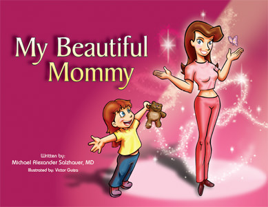
My Beautiful Mommy, a book aimed for the children's market about plastic surgery. Yeah.
 The first thing I thought while looking at this wasn't "well, this looks absolutely weird" as my friend did when I showed it to him but "isn't that Obsidian Dawn's Glitter Brushes set?" 

Then. "I'm going to assume the layer the brushes were on was set to Overlay Mode." 

Some excerpts from the book found on Josh Harris' blog. Brushes, brushes everywhere.
In my defense, I used and abused that brush set to the point where without it I don't think my products they were used for would have looked as good - but I can recognize Comic Sans MS and Calibri from a distance as well as who used too much Feathering around that woman on the pizza brochure. Brushes, though, add flair and magic to your illustrations without too much additional stress or effort on your part. I love brushes. This, in my opinion, isn't entirely a bad thing - I personally still need to purchase my commercial license from OD since I do like their brush sets as much as this illustrator clearly does - but there's obvious flaws to using stocks:
  1. There's arguably no originality from the use of these and you can no longer really call it "your work".
  2. They look tacky, poorly made, and do not match the style- you're better making it yourself.
  3. They are overused and you are at risk getting called out on it quickly by losers like me.
There are many other dangers. There was this manga that had a plot point about this company using a stock image, untouched except for text and information on it, for their product...at the same time another company or business used the same stock image for their product. Two of the workers had to stay overtime past closing, way into the evening, to fix the image and re-print dozens of new copies. (I forget the name of it, but graphic design only played a small part in it. Like a really small part. It's incredibly NSFW too.)

Here's the thing, though - if I do not want to put too much more effort into what I am doing, or if I really suck at designing a certain effect, stocks are perfect. I'm not a photographer, so if I need a certain photo, I go to Morguefile. Photoshopping specific kind of sparkles takes too long, so I go to Obsidian Dawn. It helps, and it shouldn't take full credibility away from your work. To make a properly executed gunshot scene in a movie, you need a combination of a muzzle flash, maybe a 3D render of bullets, and blood squibs as well as a Photoshop layer or two for bullet hits. God knows how much more hours that would take if you had to make all of that from scratch, but the fact is, it's only one detail in the whole production of the movie, your movie.

The logo for Obsidian Dawn's website, which provides brushes, vectors, and stocks.
This is why stocks make your life easier - it's quick access without money to what you want or need, and you lose less hours over the effects if you want it done as soon as possible with some great results if you know what you're doing. (It will still take you time, though. For gunshot example; I tried this once and it took two hours. I used Premiere too instead of After Effects. Don't do this kind of stuff with Premiere.) If it's free - or better yet, if it has a use and purpose whether or not it costs money or not - then why not use it? That's what Video Copilot packages are for, that's what Morguefile is for, that's what Dafont is for, and that's what Obsidian Dawn is for: to provide a bountiful amount of readily available products of varying quality for whatever you want or need.

As for overuse and easy recognition...well, it's a given and there's not too much you can do about it. If it's good, of course people will use it more often than others, like O Fortuna as their cinematic trailer music. Why else do you think obviously breathtaking masterpieces* like the Wilhelm Scream are still around?

*Given what the Wilhelm Scream is and what it defines in its place in cinema this statement is either sarcasm, truth, or to each their own. You decide.

Friday, February 18, 2011

007: Change Rage

Why are websites keeping layout or usability changes nobody likes?

About a few weeks ago while I was on Facebook, I found out I had this:


Oh dear sweet mother of Thomas Edison just no.

This is Facebook's photo-viewing lightbox, implemented sometime last year. I abhorred it. I used Fancybox on my own website for this type of thing, but I had pages linked to non-lightbox versions of my gallery works for those who wanted to view it in a bigger size.  Unfortunately, there's no way I could turn this off and never see it again. I've looked on Gizmodo, Engadget, Google, and there appears to be no way of doing it simply on Facebook without some kind of browser extension or one or two clicks or keyboard commands. Call me lazy, but even that seems like too much effort for something I simply would like to turn off.

Is this the only time I've had this box? No, when it was first implemented I hatedx3 it and I ranted about it so much, it would make a Livejournal user proud. Eventually, it went away, and I could only imagine Facebook finally answered the outcry of majority dislike against it. Nope, Facebook just decided to spare me for awhile before it returned.

First off, I'm biased. I don't like change. If it completely changes how something I have become used to is done, I'm very against it. There were some changes I liked that websites have done over the years. I like how Youtube can let you change the titles of your videos now so you don't have to reupload them just for a new title. I like how Facebook decided to move names above statuses or posts instead of right next to them. I like how Google lets you turn off the automatic search if you don't want it to automatically search something random for you. I don't like how Facebook doesn't let you turn off this blasted lightbox, I don't like Youtube's latest front page layout, and for the love of all that is good, what did Gawker just do to their websites?!
Haters to the left - which is Gizmodo.com's old design before the new design, on the right.
Screenshot taken 02/18/11, click for full view.
WHAT. HAPPENED? If anything, this only proves to me I'm incredibly out of the loop since this looks like it's set on mobile compatibility and I lack a smartphone of any sort. But from first impressions, I see attempts at a sleek white style a la Apple, a professional tabloid-type feel like online newspapers and any free Wordpress/Blogspot preset, and Serif fonts.

Freaking. Serif. Fonts. As the main typeface on blogs about the latest in the geek industry.

There is a reason Apple doesn't use Apple Garamond anymore and that's because Myriad exists. Anybody who has been paying attention to the latest in the geek industry knows that clearly, Sans Serif is the way to go. As somebody said about this as well, these new Gawker layouts lose all personal touch - now I'm immediately looking to the left instead of the front page I may or may not be interested in, instead of just scrolling through the front page and easily picking out what I want to read based on what pops out.

I find that accepting major changes like this, or in general just dealing with it as life moves on, is either incredibly easy or incredibly hard during the transition. Transitions are difficult when it's a huge jump from the sun to the moon. Heck, sometimes you might not even be able to accept the change at all and just ragequit, something I'm probably not going to do until Facebook gets triumphed over. This applies to real life as well as anything beyond web structure and design. But, here's the thing - why should we have to accept that change?

My last blog post, Corporate Logo Rage, discussed how that new Gap logo was so terrible that they actually reverted back to the old one. Some people wondered why Gap would cave in, claiming it showed weakness in the strong business hold it was supposed to have as a corporation. Others said it was good that Gap reverted back, claiming it showed that the customers and public were held in the utmost importance to guarantee full satisfaction.

The majority didn't accept Gap's bold Helvetica gradient-square-in-the-corner change, because the majority didn't like it. And God help me, if that can happen, then why can't I at least turn off the Facebook lightbox if the majority didn't* like it either?

*By now I suspect people have gone through the getting-used-to-it phase if they've had it for awhile. I've only recently gotten this so my outcry is a little late. That isn't the main point though.

Wednesday, January 12, 2011

005: Graphic Design Rage

Why is it when you Google Image "graphic design" you always get this?

From napleswebdesign.net
It's worse when you Google Image "graphic illustration". Now, I'm not saying this bad, I love these kind of things. But this is what a majority of people must think of right away when you think of a graphic designer: minimalism and a thousand circles and lines with gradients all over with eye-popping colours.

Obviously that's not what it's limited to but it's something that has always bugged me even before I wanted to start doing this. It's cool, but it just seems very overdone now and I haven't seen any unique examples that stand out from the rest lately.

Breaking my Tuesday-Thursday schedule plan to update this blog since I don't have outside work this week until the end of it. (When I say outside work, I mean a job that is not related to graphic design, but let's not get into that just yet.) I've managed to personalize this blog a little with a new banner as well as some other things added. Note the word "personalize" and not "spice things up/make it look better" since I know where the fine line is between those two. Let me know what you think with some comments or some feedback!

I'm also looking for some affiliates, as well as anybody who wants to promote their website or services right now. Hit me up as well on the comments or drop me an email at vcruz (at) live.ca and I'll get back to you ASAP!

Monday, January 3, 2011

003: Bot Rage

I woke up to this:


What in the name of Halle Berry is this?

This entry will be the start of something a little more out-of-topic with the blog's main point but divulges into the aspect of internet - that is, the case of why on earth are bots starting to attack the Contact Form on my website, which you can see here.  I would basically get e-mails listed from myself but instead of a filled-out contact form, it would contain stuff that looks like this:
Values submitted from VC:
Send-contactus : 1
Author Name : [php]echo('casper'.php_uname().'kae');die();[/php]
I have no idea what it's supposed to execute but at the very least it has the word "die" in it, so of course I'm suspicious. 

Now, I think I have a slight idea as to why this massive influx happened. In the previous post before, I had linked my website again as I did just now on this website. I'm going to go ahead and safely guess that the spambots took advantage of this information and now I'm dealing with some type of malicious code. This has happened before, though, so I'm not new to it. This, however, is the first time I have to wake up to find more than 2 - 3 emails of this sort sitting in my, for lack of better terminology, crappy Hotmail inbox.

After finally finding something on Google about this today, it definitely appears to be some type of malicious coding known as a "content injection attack". I'm not going to pretend I have any clue what that means but this is probably bad either way, and I'm probably going to have to look into getting a captcha installed.